Syncfusion.Blazor.Buttons 31.2.18
Syncfusion® Blazor Button Components
This package contains Blazor Button, Blazor CheckBox, Blazor Chips, Blazor Radio Button, Blazor Toggle Switch Button, Blazor Floating Action Button and Blazor Speed Dial components for Blazor application.
System Requirements
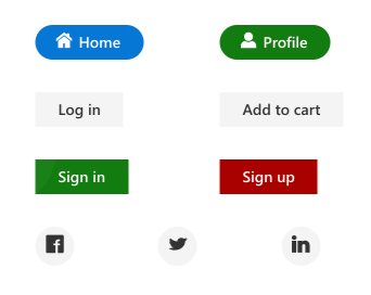
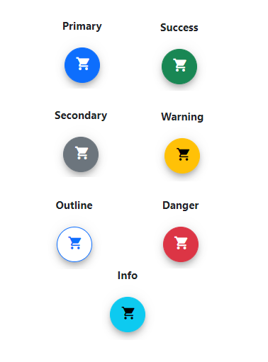
Blazor Button
The Blazor Button is a custom HTML5 button control. It has several built-in features such as support for icons, predefined styles, different button types, different button sizes, and UI customization. Toggle and repeat button functionality can be achieved by handling a click event.
Getting Started
Resources
- Blazor Button Component Features Overview
- Blazor Button Component Documentation
- Blazor Button Component Demos
- Blazor Button Component Video Tutorials
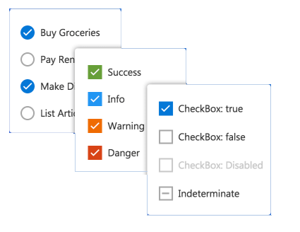
Blazor CheckBox
The Blazor Checkbox is a custom checkbox-type HTML5 input component for selecting one or more options from a list of predefined choices. It supports an indeterminate state, different sizes, custom labels and positions, and UI customization.
Getting Started
Resources
- Blazor CheckBox Component Features Overview
- Blazor CheckBox Component Documentation
- Blazor CheckBox Component Demos
- Blazor CheckBox Component Video Tutorials
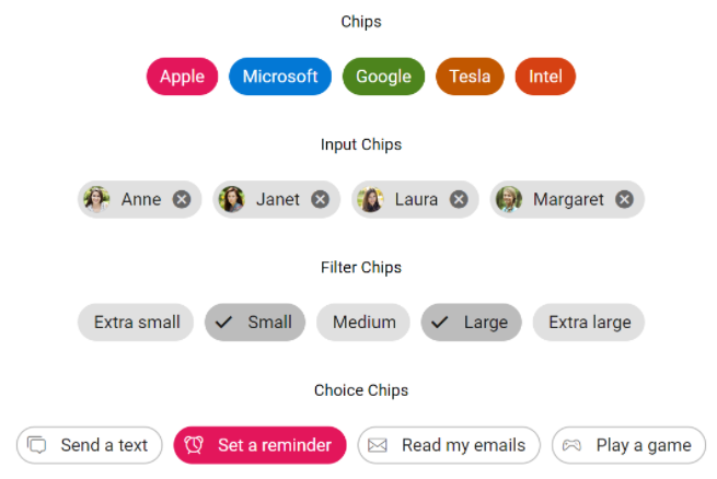
Blazor Chips
The Blazor Chips is a feature-rich component that provides small blocks of text information. Blazor Chips can also contain avatars, images, letters, and close icons. They can be used as tags when filtering contacts and mail inbox, selecting single or multiple choices from available options, and providing input to an application.
Getting Started
Resources
- Blazor Chips Component Features Overview
- Blazor Chips Component Documentation
- Blazor Chips Component Demos
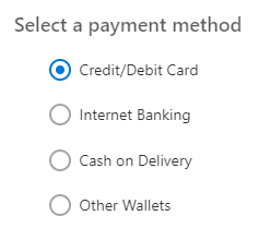
Blazor Radio Button
The Blazor Radio Button is a custom radio-type HTML5 input component for selecting one option from a list of predefined choices. It supports different states, sizes, labels, label positions, and UI customizations.
Getting Started
- Getting Started with Blazor Radio Button in Web App
- Getting Started with Blazor Radio Button in WASM App
Resources
- Blazor Radio Button Component Features Overview
- Blazor Radio Button Component Documentation
- Blazor Radio Button Component Demos
- Blazor Radio Button Component Video Tutorials
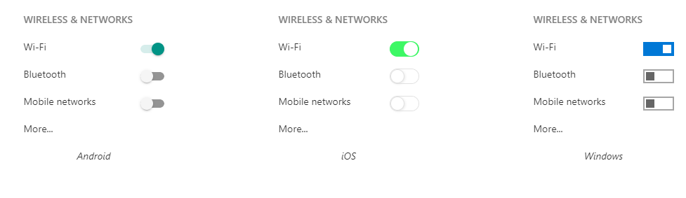
Blazor Toggle Switch Button
The Blazor Toggle Switch Button is a custom HTML5 input-type checkbox component that allows you to perform a toggle (on/off) action between checked and unchecked states. It supports different sizes, labels, label positions, and UI customization.
Getting Started
- Getting Started with Blazor Toggle Switch Button in Web App
- Getting Started with Blazor Toggle Switch Button in WASM App
Resources
- Blazor Toggle Switch Button Component Features Overview
- Blazor Toggle Switch Button Component Documentation
- Blazor Toggle Switch Button Component Demos
- Blazor Toggle Switch Button Component Video Tutorials
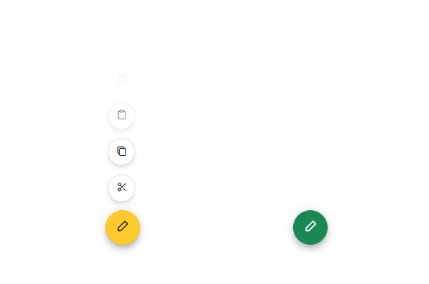
Blazor Floating Action Button
The Blazor Floating Action Button component performs the primary action that appears in front of all screen contents. It has several built-in features such as support for icons, predefined styles, positions, and UI customization.
Getting Started
- Getting Started with Blazor Floating Action Button in Web App
- Getting Started with Blazor Floating Action Button WASM App
Resources
- Blazor Floating Action Button Component Features Overview
- Blazor Floating Action Button Component Documentation
- Blazor Floating Action Button Component Demos
- Blazor Floating Action Button Component Video Tutorials
Blazor Speed Dial
The Blazor Speed Dial component is an extension of the floating action button that displays a list of action buttons when clicked. It has several built-in features such as support for items, predefined styles, positions, and UI customization.
Getting Started
- Getting Started with Blazor Speed Dial in Web App
- Getting Started with Blazor Speed Dial in WASM App
Resources
- Blazor Speed Dial Component Features Overview
- Blazor Speed Dial Component Documentation
- Blazor Speed Dial Component Demos
- Blazor Speed Dial Component Video Tutorials
Support and feedback
- For any other queries, reach our Syncfusion® support team or post the queries through the community forums.
- Provide feature request through the Syncfusion® feedback portal
License
This is a commercial product and requires a paid license for possession or use. Syncfusion® licensed software, including this component, is subject to the terms and conditions of Syncfusion® EULA. You can purchase a license here or start a free 30-day trial here.
About Syncfusion®
Founded in 2001 and headquartered in Research Triangle Park, N.C., Syncfusion® has more than 29,000 customers and more than 1 million users, including large financial institutions, Fortune 500 companies, and global IT consultancies.
Today, we provide 1800+ components and frameworks for web (Blazor, ASP.NET Core, ASP.NET MVC, ASP.NET WebForms, JavaScript, Angular, React, Vue, and Flutter), mobile (Xamarin, Flutter, UWP, and JavaScript), and desktop development (WinForms, WPF, WinUI, Flutter and UWP). We provide ready-to-deploy enterprise software for dashboards, reports, data integration, and big data processing. Many customers have saved millions in licensing fees by deploying our software.
sales@syncfusion.com | www.syncfusion.com | Toll Free: 1-888-9 DOTNET
Showing the top 20 packages that depend on Syncfusion.Blazor.Buttons.
| Packages | Downloads |
|---|---|
|
Syncfusion.Blazor.Lists
This package provides the functionality to utilize the features of Syncfusion Blazor ListView component and more.
|
3 |
|
Syncfusion.Blazor.Popups
This package provides the functionality to utilize the features of Syncfusion® Blazor Dialog and Tooltip.
|
2 |
|
Syncfusion.Blazor.Lists
This package provides the functionality to utilize the features of Syncfusion Blazor ListView component and more.
|
2 |
|
Syncfusion.Blazor.Grid
This package provides the functionality to utilize the features of Syncfusion® Blazor DataGrid component and more.
|
2 |
|
Syncfusion.Blazor.Lists
This package provides the functionality to utilize the features of Syncfusion® Blazor ListView component and more.
|
2 |
|
Syncfusion.Blazor.Inputs
This package provides the functionality to utilize the features of Syncfusion® Blazor Color Picker, File Upload, MaskedTextBox, NumericTextBox, Slider, TextBox and Rating.
|
2 |
|
Syncfusion.Blazor.Grid
The Blazor DataGrid component is used to display and manipulate tabular data with configuration options to control the way the data is presented. It can pull data from data sources such as IEnumerable objects, OData web services, or DataManager and binding data fields to columns. It also displays the column header to identify the field with support for grouped records.The most important features available in the datagrid component are paging, sorting, filtering, searching, and grouping.
Key Features
• Data sources: Binds the datagrid component with IEnumerable, DataManager or perform manual data binding.
• Sorting and grouping: Supports n level of sorting and grouping.
• Filtering: Offers filter bar in each column to filter data.
• Paging: Allows easy switching between pages using the pager bar.
• Editing: Provides the options for create, read, update, and delete operations.
• Columns: The column definitions are used as the dataSource schema in the DataGrid. This plays a vital role in rendering column values in the required format.
o Reordering: Allows drag and drop of any column anywhere in the grid’s column header row, thus allowing repositioning of columns.
o Column Chooser: The column chooser provides a list of column names paired with check boxes that allow the visibility to be toggled on the fly.
o Resizing: Resizing allows changing column width on the fly by simply dragging the right corner of the column header.
o Freeze: Columns and rows can be frozen to allow scrolling and comparing cell values.
o Foreign data source: This provides the option to show values from external or lookup data sources in a column based on foreign key/value mapping.
• Selection: Rows or cells can be selected in the datagrid. One or more rows or cells can also be selected by holding Ctrl or Command, or programmatically.
• Aggregation: Provides the option to easily visualized the Aggregates for column values.
• Context menu: The context menu provides a list of actions to be performed in the datagrid. It appears when a cell, header, or the pager is right-clicked.
• Clipboard: Selected rows and cells can be copied from the datagrid
• Export: Provides the options to Export the datagrid data to Excel, PDF, and CSV formats.
• RTL support: Provides right-to-left mode that aligns the datagrid content from right to left.
• Localization: Provides an inherent support to localize the UI.
• Live Updates: Optimized for handling live data updates.
• Master Detail Grid: The detail grid shows the corresponding child information of the selected parent grid record.
Helpful links:
Feature tour: https://www.syncfusion.com/blazor-components/blazor-datagrid?utm_source=nuget&utm_medium=listing
Documentation: https://blazor.syncfusion.com/documentation/datagrid/?utm_source=nuget&utm_medium=listing
Demos: https://blazor.syncfusion.com/demos/datagrid/overview?utm_source=nuget&utm_medium=listing
Support:
Incident: https://www.syncfusion.com/support/directtrac/incidents/newincident/?utm_source=nuget&utm_medium=listing
Forum: https://www.syncfusion.com/forums/blazor-components/?utm_source=nuget&utm_medium=listing
This is a commercial product and requires a paid license for possession or use. Syncfusion’s licensed software, including this component, is subject to the terms and conditions of Syncfusion's EULA (https://www.syncfusion.com/eula/es/). To acquire a license, you can purchase one at https://www.syncfusion.com/sales/products or start a free 30-day trial here (https://www.syncfusion.com/account/manage-trials/start-trials).
© Copyright 2021 Syncfusion, Inc. All Rights Reserved. The Syncfusion Essential Studio license and copyright applies to this distribution.
|
2 |
|
Syncfusion.Blazor.Popups
The components, ‘dialog’ and ‘tooltip’ are used to display information in a popup to the users.
List of components:
• Dialog
• Tooltip
Dialog:
The dialog component displays important information or gets input from the users. This component supports modal/non-modal (modeless), built-in buttons, positioning, animation, draggable, and template features. It helps create alert, prompt, and confirmation dialogs easily.
Key Features:
• Modal: The modal dialogue prevents interaction with the parent window.
• Positioning: Supports customization of its display position.
• Animation: Applies animation effects on opening and closing the dialog.
• Template: Provides an option to customize its header and footer.
• Built-in buttons: Provides a built-in support to add buttons with its properties.
Helpful Links:
• [Getting Started]( https://blazor.syncfusion.com/documentation/dialog/getting-started/ )
• [View Online Demos]( https://blazor.syncfusion.com/demos/dialog/default-functionalities?theme=bootstrap4)
• [Feature Tour]( https://www.syncfusion.com/blazor-components/blazor-modal-dialog)
Tooltip:
The Blazor Tooltip is a pop-up that shows information or a message when users hover, click, focus, or touch an image, button, anchor tag, etc. The information displayed in the Tooltip can include simple text, images, hyperlinks, or custom templates.
Key features:
• Positions - Allows you to display the tooltip in 12 different positions.
• Animation - Supports animation effects while showing/hiding the tooltip.
• Content - Assigns with static text, template, or loaded dynamically via AJAX.
• Opening modes - Supports four opening modes such as hover, click, focus, and custom.
• Smart positioning - Supports auto tip positioning.
• Mouse trail - Moves along with mouse pointer using the mouse trailing option.
• Sticky mode - Opens in sticky mode, and allows you to close/hide the Tooltip manually.
Helpful links:
• [Feature tour]: https://www.syncfusion.com/blazor-components/blazor-tooltip
• [Documentation]: https://blazor.syncfusion.com/documentation/tooltip/?utm_source=nuget&utm_medium=listing
• [Demos]: https://blazor.syncfusion.com/demos/tooltip/default?theme=bootstrap4
Support:
Incident: https://www.syncfusion.com/support/directtrac/incidents/newincident/?utm_source=nuget&utm_medium=listing
Forum: https://www.syncfusion.com/forums/blazor-components/?utm_source=nuget&utm_medium=listing
This is a commercial product and requires a paid license for possession or use. Syncfusion’s licensed software, including this component, is subject to the terms and conditions of Syncfusion's EULA (https://www.syncfusion.com/eula/es/). To acquire a license, you can purchase one at https://www.syncfusion.com/sales/products or start a free 30-day trial here (https://www.syncfusion.com/account/manage-trials/start-trials).
© Copyright 2021 Syncfusion, Inc. All Rights Reserved. The Syncfusion Essential Studio license and copyright applies to this distribution.
|
2 |
|
Syncfusion.Blazor.Navigations
This package provides the functionality to utilize the features of Syncfusion Blazor Accordion, Context Menu, Menu Bar, Tabs, Toolbar, Tree-view, and Sidebar.
|
2 |
|
Syncfusion.Blazor.Notifications
This package provides the functionality to utilize the features of Syncfusion® Blazor Toast, Message and Skeleton.
|
2 |
|
Syncfusion.Blazor.Notifications
This package provides the functionality to utilize the features of Syncfusion Blazor Toast, Message and Skeleton.
|
2 |
|
Syncfusion.Blazor.Grid
This package provides the functionality to utilize the features of Syncfusion Blazor DataGrid component and more.
|
2 |
.NET 8.0
- Syncfusion.Blazor.Core (>= 31.2.18)
.NET 9.0
- Syncfusion.Blazor.Core (>= 31.2.18)
.NET 10.0
- Syncfusion.Blazor.Core (>= 31.2.18)
| Version | Downloads | Last updated |
|---|---|---|
| 31.2.18 | 1 | 12/09/2025 |
| 31.2.16 | 0 | 12/09/2025 |
| 31.2.15 | 1 | 12/09/2025 |
| 31.2.12 | 1 | 12/09/2025 |
| 31.2.10 | 0 | 11/12/2025 |
| 31.2.5 | 1 | 12/09/2025 |
| 31.2.4 | 0 | 10/28/2025 |
| 31.2.3 | 1 | 12/09/2025 |
| 31.2.2 | 0 | 10/15/2025 |
| 31.1.23 | 0 | 10/06/2025 |
| 31.1.22 | 0 | 09/30/2025 |
| 31.1.21 | 0 | 09/22/2025 |
| 31.1.20 | 0 | 09/16/2025 |
| 31.1.19 | 0 | 09/11/2025 |
| 31.1.18 | 0 | 09/10/2025 |
| 31.1.17 | 1 | 12/09/2025 |
| 30.2.7 | 0 | 08/25/2025 |
| 30.2.6 | 0 | 08/18/2025 |
| 30.2.5 | 0 | 08/13/2025 |
| 30.2.4 | 1 | 12/09/2025 |
| 30.1.42 | 0 | 07/28/2025 |
| 30.1.41 | 0 | 07/22/2025 |
| 30.1.40 | 0 | 07/14/2025 |
| 30.1.39 | 0 | 07/08/2025 |
| 30.1.38 | 0 | 07/01/2025 |
| 30.1.37 | 1 | 12/09/2025 |
| 29.2.11 | 0 | 06/16/2025 |
| 29.2.10 | 1 | 12/09/2025 |
| 29.2.9 | 0 | 06/05/2025 |
| 29.2.8 | 0 | 06/03/2025 |
| 29.2.7 | 0 | 05/26/2025 |
| 29.2.5 | 0 | 05/21/2025 |
| 29.2.4 | 2 | 12/09/2025 |
| 29.1.41 | 0 | 05/05/2025 |
| 29.1.40 | 0 | 04/28/2025 |
| 29.1.39 | 0 | 04/21/2025 |
| 29.1.38 | 0 | 04/14/2025 |
| 29.1.37 | 0 | 04/08/2025 |
| 29.1.35 | 0 | 04/01/2025 |
| 29.1.33 | 0 | 03/25/2025 |
| 28.2.12 | 0 | 03/19/2025 |
| 28.2.11 | 0 | 03/10/2025 |
| 28.2.9 | 0 | 03/04/2025 |
| 28.2.7 | 1 | 12/09/2025 |
| 28.2.6 | 0 | 02/17/2025 |
| 28.2.5 | 1 | 12/09/2025 |
| 28.2.4 | 1 | 12/09/2025 |
| 28.2.3 | 1 | 12/09/2025 |
| 28.1.41 | 0 | 01/20/2025 |
| 28.1.39 | 0 | 01/13/2025 |
| 28.1.38 | 1 | 12/09/2025 |
| 28.1.37 | 0 | 12/31/2024 |
| 28.1.36 | 0 | 12/23/2024 |
| 28.1.35 | 0 | 12/18/2024 |
| 28.1.33 | 0 | 12/12/2024 |
| 27.2.5 | 0 | 12/02/2024 |
| 27.2.4 | 0 | 11/26/2024 |
| 27.2.3 | 0 | 11/22/2024 |
| 27.2.2 | 1 | 12/09/2025 |
| 27.1.58 | 1 | 12/09/2025 |
| 27.1.57 | 0 | 10/28/2024 |
| 27.1.56 | 0 | 10/23/2024 |
| 27.1.55 | 0 | 10/21/2024 |
| 27.1.53 | 0 | 10/14/2024 |
| 27.1.52 | 0 | 10/07/2024 |
| 27.1.51 | 0 | 09/30/2024 |
| 27.1.50 | 0 | 09/23/2024 |
| 27.1.48 | 0 | 09/18/2024 |
| 26.2.14 | 0 | 09/09/2024 |
| 26.2.13 | 0 | 09/05/2024 |
| 26.2.12 | 0 | 09/02/2024 |
| 26.2.11 | 0 | 08/27/2024 |
| 26.2.10 | 0 | 08/19/2024 |
| 26.2.9 | 0 | 08/12/2024 |
| 26.2.8 | 1 | 12/09/2025 |
| 26.2.7 | 0 | 07/29/2024 |
| 26.2.5 | 1 | 12/09/2025 |
| 26.2.4 | 0 | 07/24/2024 |
| 26.1.42 | 0 | 07/15/2024 |
| 26.1.41 | 0 | 07/08/2024 |
| 26.1.40 | 0 | 07/01/2024 |
| 26.1.39 | 1 | 12/09/2025 |
| 26.1.38 | 0 | 06/18/2024 |
| 26.1.35 | 0 | 06/11/2024 |
| 25.2.7 | 0 | 06/03/2024 |
| 25.2.6 | 1 | 12/09/2025 |
| 25.2.5 | 0 | 05/21/2024 |
| 25.2.4 | 1 | 12/09/2025 |
| 25.2.3 | 1 | 12/09/2025 |
| 25.1.42 | 0 | 04/29/2024 |
| 25.1.41 | 0 | 04/23/2024 |
| 25.1.40 | 0 | 04/15/2024 |
| 25.1.39 | 0 | 04/08/2024 |
| 25.1.38 | 0 | 04/01/2024 |
| 25.1.37 | 0 | 03/26/2024 |
| 25.1.35 | 0 | 03/15/2024 |
| 24.2.9 | 0 | 03/04/2024 |
| 24.2.8 | 0 | 02/26/2024 |
| 24.2.7 | 0 | 02/19/2024 |
| 24.2.6 | 0 | 02/14/2024 |
| 24.2.5 | 1 | 12/09/2025 |
| 24.2.4 | 0 | 02/05/2024 |
| 24.2.3 | 0 | 01/31/2024 |
| 24.1.47 | 0 | 01/22/2024 |
| 24.1.46 | 0 | 01/16/2024 |
| 24.1.45 | 0 | 01/08/2024 |
| 24.1.44 | 0 | 01/02/2024 |
| 24.1.43 | 0 | 12/27/2023 |
| 24.1.41 | 0 | 12/18/2023 |
| 23.2.7 | 0 | 12/06/2023 |
| 23.2.6 | 0 | 11/28/2023 |
| 23.2.5 | 0 | 11/23/2023 |
| 23.2.4 | 1 | 12/09/2025 |
| 23.1.44 | 0 | 11/06/2023 |
| 23.1.43 | 0 | 10/30/2023 |
| 23.1.42 | 0 | 10/23/2023 |
| 23.1.41 | 0 | 10/16/2023 |
| 23.1.40 | 0 | 10/10/2023 |
| 23.1.39 | 0 | 10/04/2023 |
| 23.1.38 | 0 | 09/26/2023 |
| 23.1.36 | 0 | 09/15/2023 |
| 22.2.12 | 0 | 09/05/2023 |
| 22.2.11 | 0 | 08/28/2023 |
| 22.2.10 | 1 | 12/09/2025 |
| 22.2.9 | 1 | 12/09/2025 |
| 22.2.8 | 0 | 08/07/2023 |
| 22.2.7 | 0 | 08/02/2023 |
| 22.2.5 | 0 | 07/27/2023 |
| 22.1.39 | 0 | 07/18/2023 |
| 22.1.38 | 0 | 07/11/2023 |
| 22.1.37 | 0 | 07/03/2023 |
| 22.1.36 | 0 | 06/28/2023 |
| 22.1.34 | 0 | 06/21/2023 |
| 21.2.10 | 0 | 06/13/2023 |
| 21.2.9 | 0 | 06/06/2023 |
| 21.2.8 | 1 | 12/09/2025 |
| 21.2.6 | 0 | 05/22/2023 |
| 21.2.5 | 0 | 05/15/2023 |
| 21.2.4 | 0 | 05/09/2023 |
| 21.2.3 | 0 | 05/03/2023 |
| 21.1.41 | 0 | 04/19/2023 |
| 21.1.39 | 1 | 12/09/2025 |
| 21.1.38 | 0 | 04/03/2023 |
| 21.1.37 | 0 | 03/29/2023 |
| 21.1.35 | 1 | 12/09/2025 |
| 20.4.0.54 | 0 | 03/13/2023 |
| 20.4.0.53 | 0 | 03/07/2023 |
| 20.4.0.52 | 0 | 12/09/2025 |
| 20.4.0.51 | 0 | 02/21/2023 |
| 20.4.0.50 | 0 | 02/14/2023 |
| 20.4.0.49 | 0 | 02/07/2023 |
| 20.4.0.48 | 0 | 02/01/2023 |
| 20.4.0.44 | 1 | 12/09/2025 |
| 20.4.0.43 | 1 | 12/09/2025 |
| 20.4.0.42 | 0 | 01/04/2023 |
| 20.4.0.41 | 0 | 12/29/2022 |
| 20.4.0.40 | 0 | 12/28/2022 |
| 20.4.0.38 | 0 | 12/21/2022 |
| 20.3.0.61 | 0 | 12/09/2025 |
| 20.3.0.60 | 1 | 12/09/2025 |
| 20.3.0.59 | 0 | 11/29/2022 |
| 20.3.0.58 | 0 | 12/09/2025 |
| 20.3.0.57 | 0 | 11/15/2022 |
| 20.3.0.56 | 0 | 11/08/2022 |
| 20.3.0.52 | 0 | 10/27/2022 |
| 20.3.0.50 | 1 | 12/09/2025 |
| 20.3.0.49 | 0 | 10/11/2022 |
| 20.3.0.48 | 0 | 10/05/2022 |
| 20.3.0.47 | 0 | 09/29/2022 |
| 20.2.0.50 | 1 | 12/09/2025 |
| 20.2.0.49 | 0 | 09/13/2022 |
| 20.2.0.48 | 0 | 09/06/2022 |
| 20.2.0.46 | 0 | 08/30/2022 |
| 20.2.0.45 | 0 | 08/23/2022 |
| 20.2.0.44 | 0 | 08/16/2022 |
| 20.2.0.43 | 0 | 08/08/2022 |
| 20.2.0.40 | 0 | 07/26/2022 |
| 20.2.0.39 | 0 | 07/19/2022 |
| 20.2.0.38 | 0 | 07/12/2022 |
| 20.2.0.36 | 0 | 06/30/2022 |
| 20.1.0.61 | 0 | 06/20/2022 |
| 20.1.0.60 | 0 | 06/14/2022 |
| 20.1.0.59 | 0 | 06/07/2022 |
| 20.1.0.58 | 0 | 05/31/2022 |
| 20.1.0.57 | 2 | 12/09/2025 |
| 20.1.0.56 | 0 | 05/17/2022 |
| 20.1.0.55 | 1 | 12/09/2025 |
| 20.1.0.52 | 0 | 05/03/2022 |
| 20.1.0.51 | 0 | 04/26/2022 |
| 20.1.0.50 | 0 | 04/19/2022 |
| 20.1.0.48 | 0 | 04/12/2022 |
| 20.1.0.47 | 0 | 04/04/2022 |
| 19.4.0.56 | 1 | 12/09/2025 |
| 19.4.0.55 | 0 | 03/08/2022 |
| 19.4.0.54 | 1 | 12/09/2025 |
| 19.4.0.53 | 0 | 02/22/2022 |
| 19.4.0.52 | 0 | 02/15/2022 |
| 19.4.0.50 | 0 | 02/08/2022 |
| 19.4.0.48 | 0 | 01/31/2022 |
| 19.4.0.47 | 0 | 01/25/2022 |
| 19.4.0.43 | 0 | 01/18/2022 |
| 19.4.0.42 | 0 | 01/11/2022 |
| 19.4.0.41 | 0 | 01/04/2022 |
| 19.4.0.40 | 1 | 12/09/2025 |
| 19.4.0.38 | 0 | 12/17/2021 |
| 19.3.0.59 | 0 | 12/14/2021 |
| 19.3.0.57 | 0 | 12/07/2021 |
| 19.3.0.56 | 0 | 11/30/2021 |
| 19.3.0.55 | 0 | 11/23/2021 |
| 19.3.0.54 | 0 | 11/17/2021 |
| 19.3.0.53 | 0 | 11/12/2021 |
| 19.3.0.48 | 0 | 11/03/2021 |
| 19.3.0.47 | 0 | 10/26/2021 |
| 19.3.0.46 | 1 | 12/09/2025 |
| 19.3.0.45 | 0 | 10/12/2021 |
| 19.3.0.44 | 0 | 12/09/2025 |
| 19.3.0.43 | 0 | 09/30/2021 |
| 19.2.0.62 | 1 | 12/09/2025 |
| 19.2.0.60 | 0 | 09/07/2021 |
| 19.2.0.59 | 0 | 08/30/2021 |
| 19.2.0.57 | 0 | 08/24/2021 |
| 19.2.0.56 | 1 | 12/09/2025 |
| 19.2.0.55 | 0 | 08/11/2021 |
| 19.2.0.51 | 0 | 08/02/2021 |
| 19.2.0.49 | 0 | 07/27/2021 |
| 19.2.0.48 | 1 | 12/09/2025 |
| 19.2.0.47 | 0 | 07/13/2021 |
| 19.2.0.46 | 0 | 07/06/2021 |
| 19.2.0.44 | 1 | 12/09/2025 |
| 19.1.0.69 | 0 | 06/14/2021 |
| 19.1.0.67 | 0 | 06/07/2021 |
| 19.1.0.66 | 0 | 05/31/2021 |
| 19.1.0.65 | 0 | 05/24/2021 |
| 19.1.0.64 | 0 | 05/19/2021 |
| 19.1.0.63 | 0 | 05/13/2021 |
| 19.1.0.59 | 1 | 12/09/2025 |
| 19.1.0.58 | 0 | 04/26/2021 |
| 19.1.0.57 | 0 | 04/20/2021 |
| 19.1.0.56 | 0 | 04/13/2021 |
| 19.1.0.55 | 0 | 04/06/2021 |
| 19.1.0.54 | 0 | 03/30/2021 |
| 18.4.0.49 | 0 | 03/23/2021 |
| 18.4.0.48 | 0 | 03/16/2021 |
| 18.4.0.47 | 0 | 03/09/2021 |
| 18.4.0.46 | 0 | 03/02/2021 |
| 18.4.0.44 | 0 | 02/23/2021 |
| 18.4.0.43 | 0 | 02/15/2021 |
| 18.4.0.42 | 0 | 02/09/2021 |
| 18.4.0.41 | 0 | 02/02/2021 |
| 18.4.0.39 | 0 | 01/28/2021 |
| 18.4.0.35 | 1 | 12/09/2025 |
| 18.4.0.34 | 0 | 01/12/2021 |
| 18.4.0.33 | 0 | 01/04/2021 |
| 18.4.0.32 | 0 | 12/30/2020 |
| 18.4.0.31 | 0 | 12/22/2020 |
| 18.4.0.30 | 0 | 12/17/2020 |